7 Sneaky Ways McDonald's Gets You To Spend More
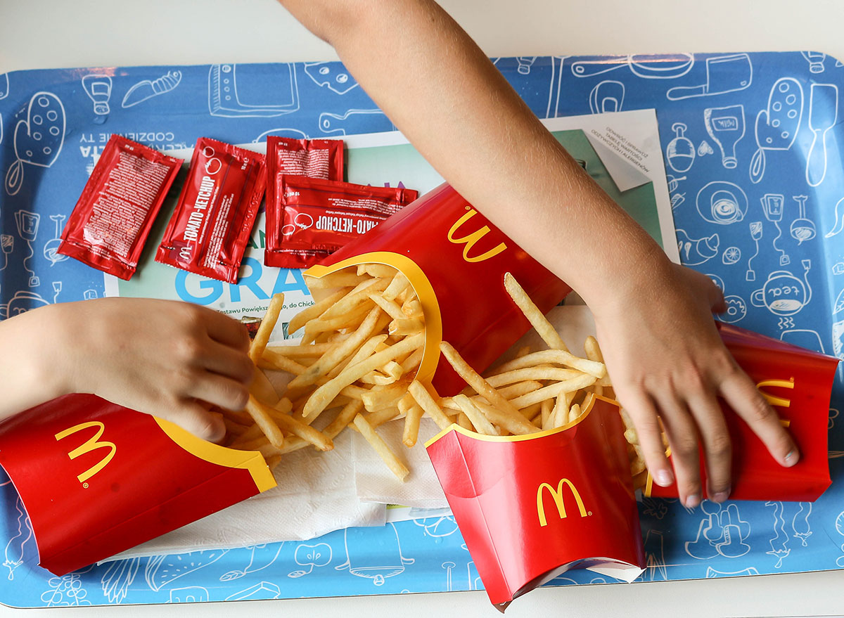
Admit it: Sometimes McDonald's is a great go-to when you're in need of a quick, cheap meal on-the-go. A simple burger and fries can really hit the spot when you need a meal fast. But have you ever noticed that despite McDonald's claim to being quick, cheap fast food, you somehow are spending more than what you anticipated to? That's because of a few sneaky ways McDonald's gets you to spend more. And to be quite honest with you, their tactics to draw in more money from consumers are pretty brilliant.
In order to decipher these sneaky methods, a consultant wrote a report for BehavioralEconmics.com to see how this fast-food chain is utilizing customer senses—and even a bit of psychology—in order to get hungry eaters to spend more money. Here are a few of the methods he found.
Advertising "signature" meals in the front, which are costly
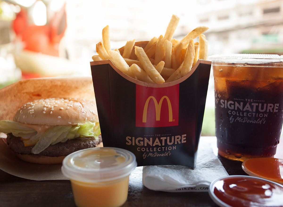
Even before you walk into a McDonald's, you probably see a few signs for different new "signature" items on the menu. Obviously, the company wants you to buy them, but it's more about how much they cost rather than how new they are. It gets your brain—and tastebuds—thinking about those signature items, which means you'll likely be craving (and ordering) that menu item by the time you get to the front of the line.
Hiding price tags
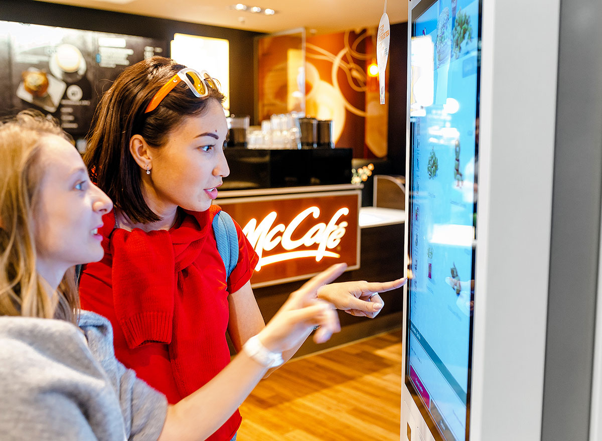
Did you ever notice how the prices for McDonald's items are discreet? Except on the menu, of course. Some of the signs, and even touch screens, will hide the amounts. This is known as "reducing psychological pain," in order for the customer to have a care-free ordering experience without them worrying about how much they are going to spend as they choose their meal.
"Signature" items take up a majority of the menu
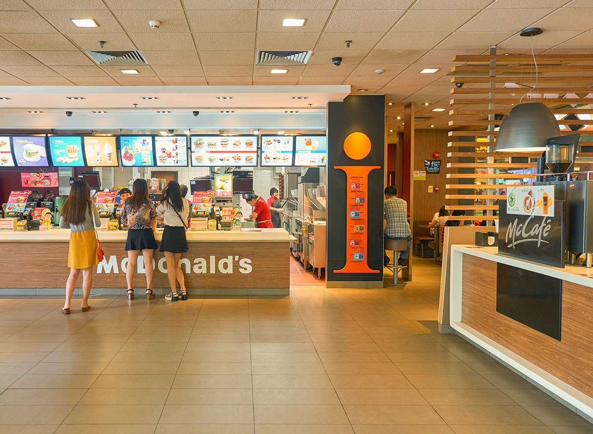
When you finally get to the menu hanging above the McDonald's employees at checkout, have you ever noticed how those traditional McDonald's menu items—chicken nuggets, McDoubles—are always smaller on the menu compared to others? That's because those traditional items only take up about 15% of the menu, while those signature items (you know, the ones you saw walking into the store) take up more than 30% of the menu space. The same goes for their digital screens as well.
Subtle animation on touch screens
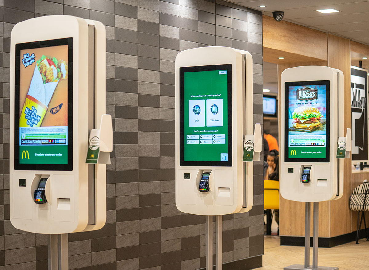
As you go about ordering your meal on a McDonald's touch screen, have you ever noticed how little items will dance and wiggle as you are choosing? That's because it's using attention cues to draw your eyes towards those pricey items. Our eyes will detect movement, and it will lead you away from those cheaper items and have you, yet again, checking out the pricey signature items available on the menu. It's a pretty clever way McDonald's gets you to spend more.
Using price anchoring
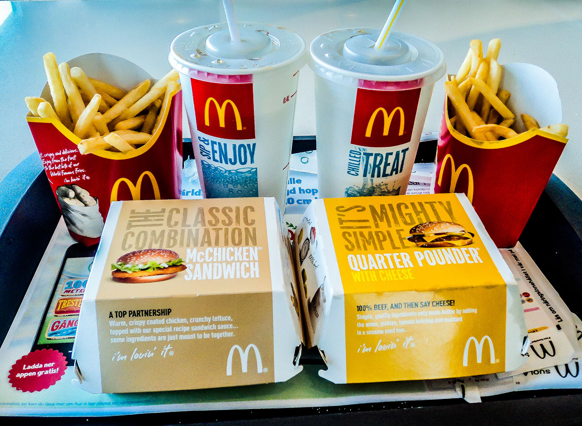
Now say you've caught on to all of McDonald's little tricks to get you to spend more, and you settle for a simple meal of chicken nuggets and fries. Those items are significantly cheaper, right? That's because McDonald's used price anchoring to get you thinking about how pricey those other items are. And now that you're spending less, well, why not spend some money on an extra milkshake? It's still cheaper than that signature burger, right? You feel good about your purchase because it didn't cost you as much as those other pricier menu items, even though you ultimately did end up spending more.
Changes in store design
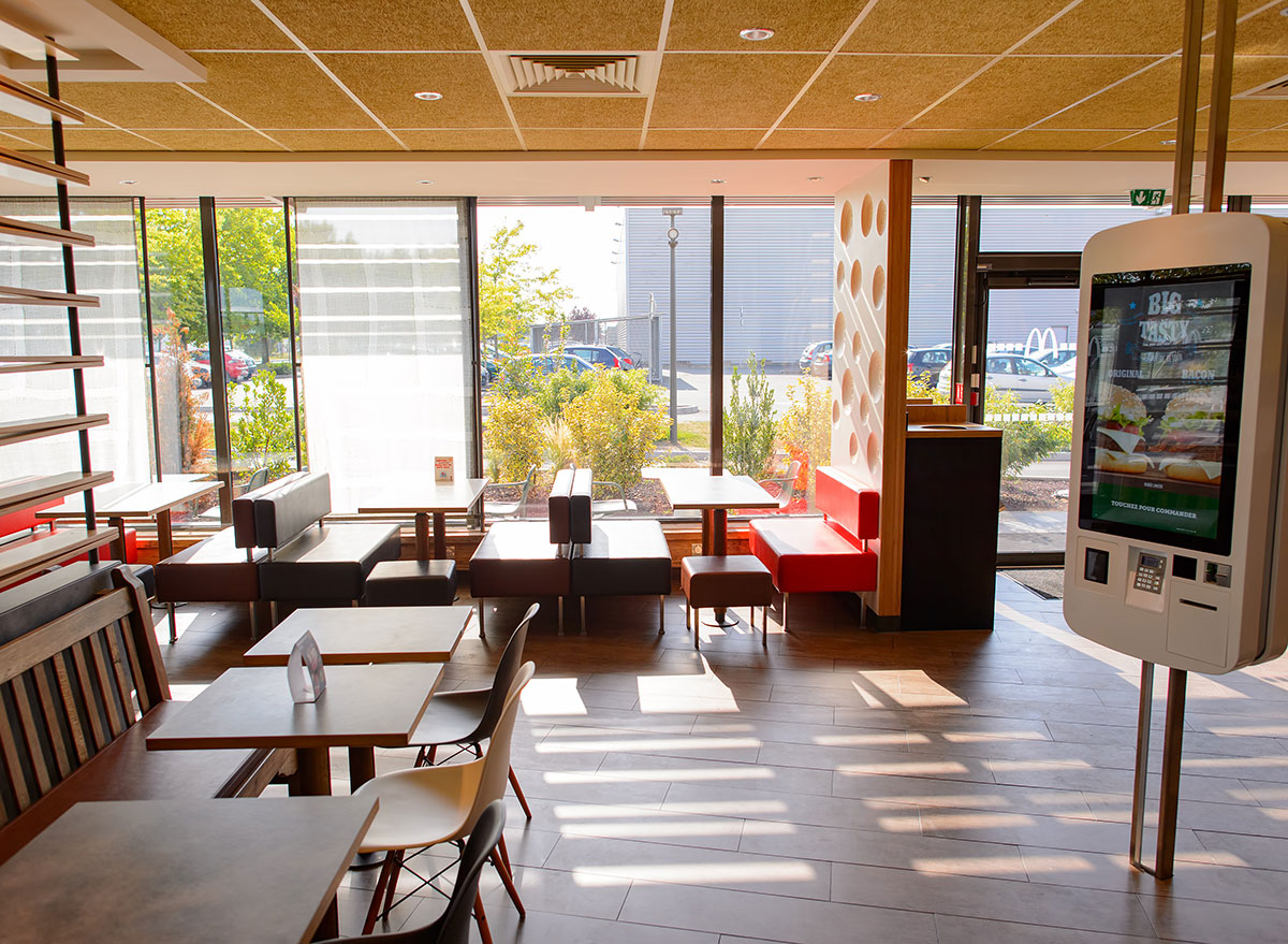
Have you noticed how McDonald's restaurants are getting a bit fancier? That's because this chain is now understanding the value of creating a totally satisfying user experience. McDonald's took the effort to launch new features and restaurant designs in order to create a pleasant dining experience for customers, causing them to want to return to that clean, beautiful McDonald's location. For more fast food news, be sure to sign up for our newsletter.
Experience chunking
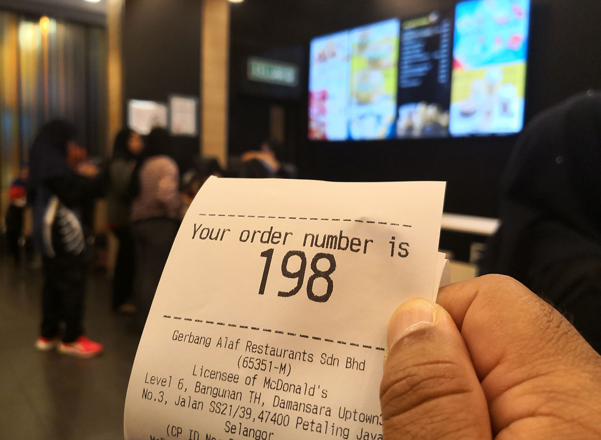
This is a principle used in many fast-food restaurants, but McDonald's knows how to do this really well. When you order from the clerk at checkout, they'll give you a receipt with a number on it and send you to a "pick up" area right next to check out. The constant movement and separation of the ordering experience is called "chunking," to make you think your time waiting for your meal was actually shorter. You probably have experienced this "quick" service model at other popular chains like Starbucks and Dunkin'.


