7 Ways Your Grocery Store Is Secretly Getting You to Spend More

Grocery shopping is challenging enough these days. Add a recession into the mix and spending more time inside a supermarket is probably the last thing you want to do in this current COVID climate. But here's the thing: Grocery stores still need your hard earned dollars and, pandemic or not, continue to operate just like they always have—by making you think that you're in control of your purse strings.
The next time you go grocery shopping, remember that you're being played. Here are 7 ways grocery stores trick you into spending more money.
Music
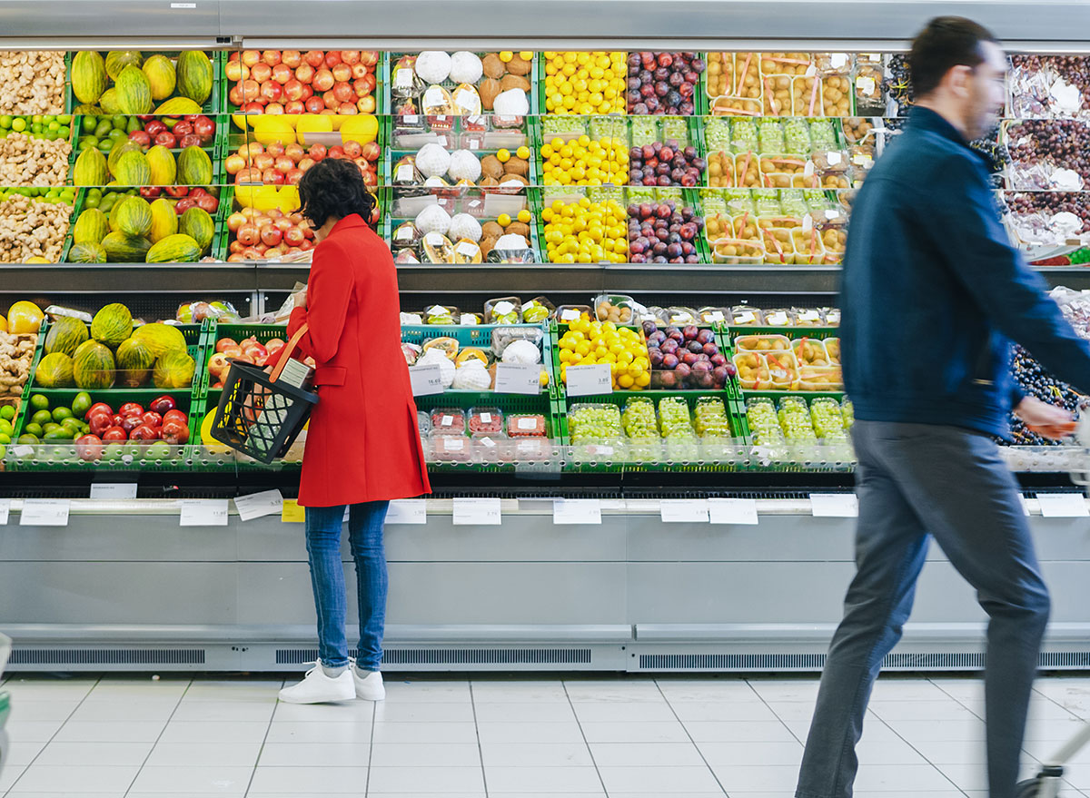
According to Cloud Cover Music, which provides licensed music for businesses, "It seems that, overwhelmingly, music can impact how long a shopper stays in the store, how long they perceive they have been in the store, how much they buy, and how reasonable they believe the price to be." This is often why easy listening or classical music is played in grocery stores—it slows you down and keeps you inside the store longer.
A 2010 study titled "Using Background Music to Affect the Behavior of Supermarket Shoppers" found that the average gross sales of a supermarket increased from $12,112.35 for fast tempo music to $16,740.23 for slow tempo music. Maybe listen to your own playlist while shopping next time. (Related: Sign up for our daily newsletter to keep yourself informed.)
Large Shopping Carts
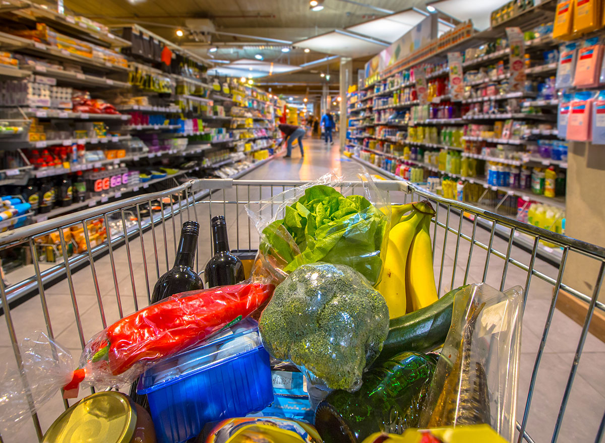
This one is pretty obvious once you're aware of it. Grocery stores prefer you use a larger cart so you don't realize how much you've bought until you reach the register. A large haul of groceries doesn't look nearly as intimidating in a large cart as it does a small one. This trick also works with ice cream and large bowls. (Related: 10 Groceries You'll Never Find Under the Same Name Again.)
Colors
It's no secret that certain colors elicit specific responses from us. A bold red wall will get a different reaction than a calming blue hue. And it's no different in grocery stores, which is one big psychology game. Cool tones, such as blue and green, have a calming effect, which encourages us to spend more and stay longer. On the flip side, warm colors, such as red, orange and yellow, will likely draw us inside of a business, because those colors are often associated with being "inviting" and "reassuring."
Shelf Position
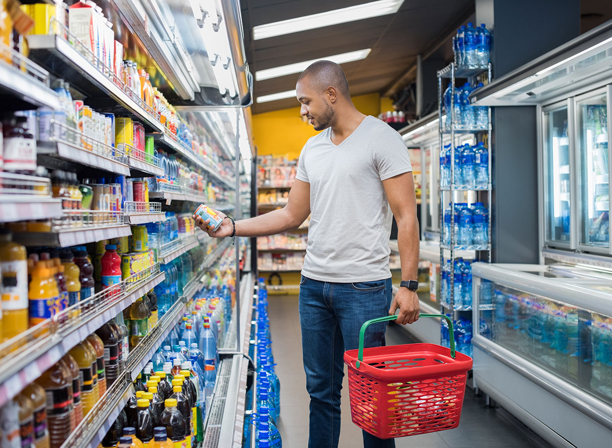
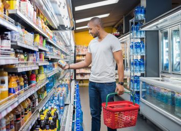
Products that turn the most profit for a store will be placed at eye-level. The thinking here is that it takes too much effort to reach up or bend down for a product, meaning you're more likely to buy items that are at eye-level. And while many expensive items will be placed on the top shelves (thus, why expensive booze is called "top shelf") and cheap items on the bottom, there is an exception: Many junk foods and sugar cereals will be placed at a lower level, to catch the attention of children.
Store Layout
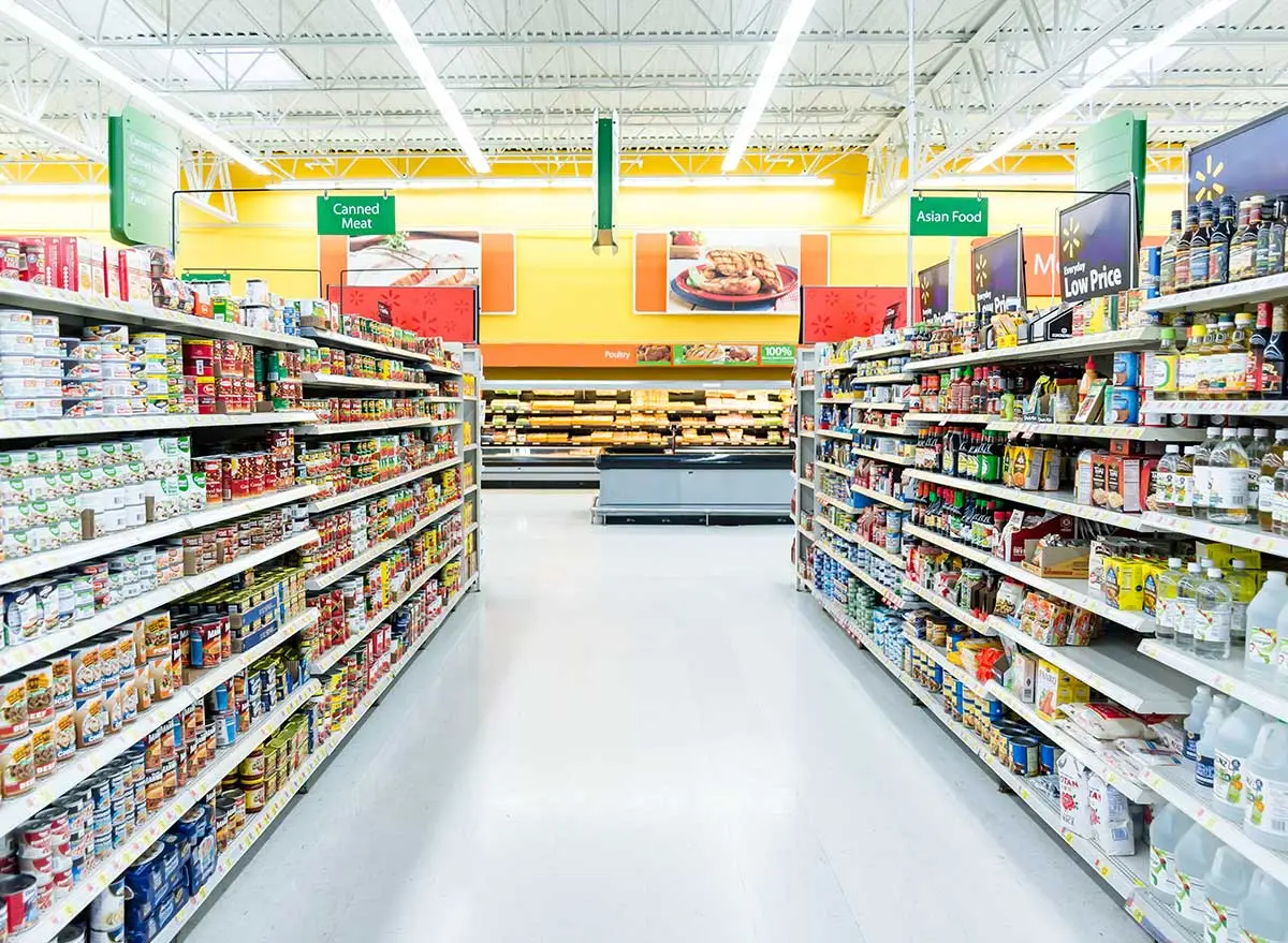
Retail management software company Vend says that a store layout essentially sets the path shoppers will take through a store, explaining that, "A well-designed layout will give customers a clear path, encourage discovery and interaction (read: increase dwell time), highlight products, and ultimately drive conversions." A grid layout, which you most often find in grocery stores and big-box retailers, creates aisles for customers to browse. They also suggest keeping items out of the entry of a store, which is often overlooked by shoppers. Instead, they recommend placing any priority products in more engaging areas deeper inside a store. There's also the fun reality that "staples" like milk, bread, and eggs are placed at the far corners of the store so you have to walk past all of the other tempting items just to get to them. Who knew you needed an extra bag of chips? Store executives, that's who. (Related: 17 Things Costco Won't Be Bringing Back.)
Free Samples
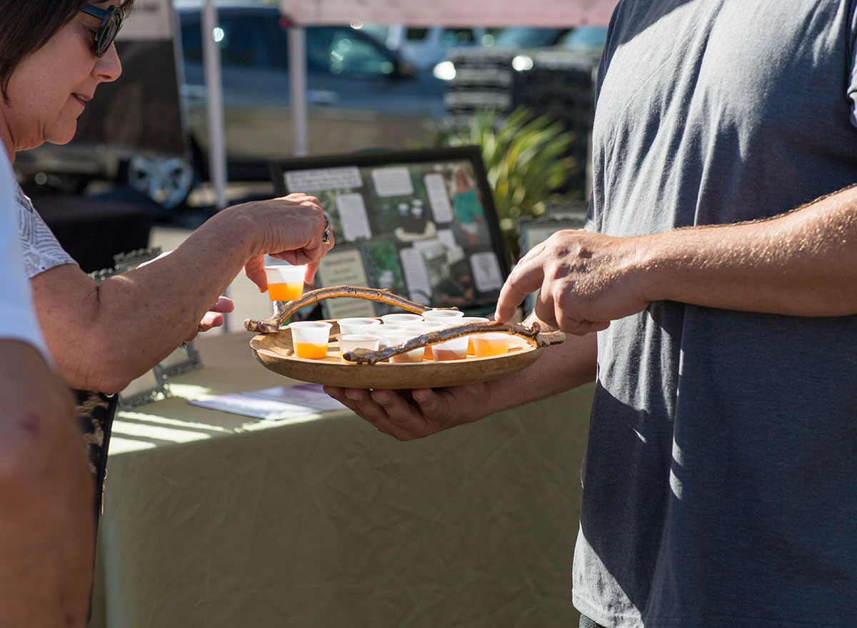
This is probably the most obtuse way for grocery stores to lure you into buying new products. Letting people sample the merchandise before opening their wallets takes any sort of guesswork out of whether or not they'll like it. There's also a subset of shoppers who feel obligated to purchase an item if they were given a free sample first.
No Windows Or Clocks
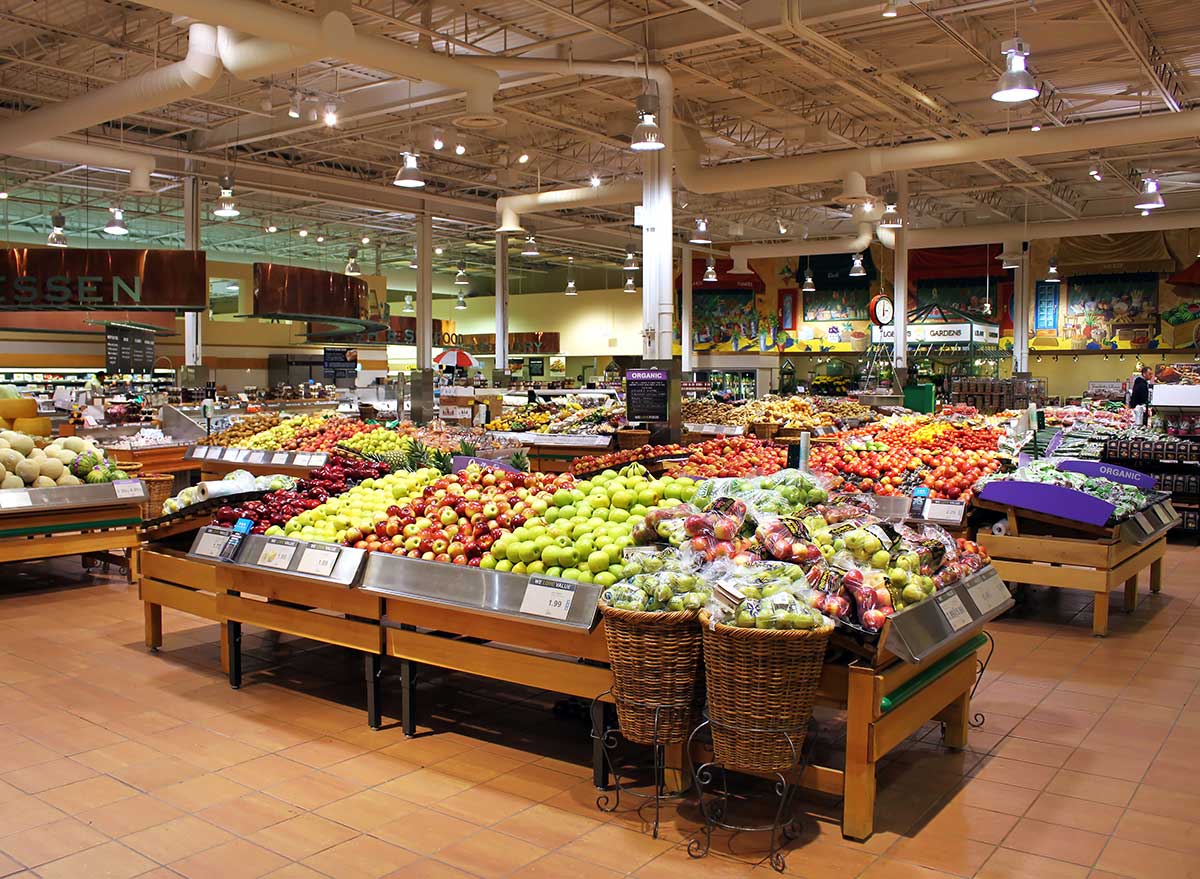
Bet you never stopped to wonder why there are no windows in grocery stores. Or clocks, for that matter. And that's exactly what grocery stores are banking on. When you lose track of time, you'll likely spend more of it shopping. Add to that some soothing tunes and before you know it, you could be pushing around a cart for an entire afternoon. Who needs a life when there's still a bakery section to browse? At least we have our smartphone clocks. For more check out these 33 Worst Mistakes You're Making at the Grocery Store.
