7 Fast Food Logos With Hidden Messages
Even if it's hard to believe, every logo has some kind of hidden message. While some are more obvious than others, logos are meant to give off an impression to customers about a product or service, and customers will make their assumptions based on the branding of an item. If customers walk away assuming the same message as the company wants them to think, that company's logo is deemed successful. Especially if it's from one of the logos you see time and time again at your favorite fast-food chains.
While logos from all kinds of chains are used to market specific messages to specific audiences, there are a few fast-food chains out there that use clever logos to get customer's attention. It's the hidden messages in those logos that you may not immediately see, but provide you with a specific feeling or assumption about that brand.
So the next time you're grabbing food at one of these fast-food chains, take a closer look at these logos. And for more fun facts about your favorite restaurants, be sure to sign up for our newsletter. Plus, read about the 100 Shocking Facts About Fast Food You Never Knew.
McDonald's
Even though those famous golden arches make up a beautiful "M" to symbolize the first letter in the famous McDonald's name, the actual reasoning behind using that giant M is a bit more seductive than you may originally have thought. Those golden arches are meant to symbolize maternal love, as in, a pair of two breasts. Don't believe it? Even the BBC confirmed it when a design consultant and psychologist recommended keeping the very specific branding. While it may seem strange (and somehow vulgar), the golden arches are meant to feel comforting to the outside world, where customers can enjoy a comforting meal.
Wendy's
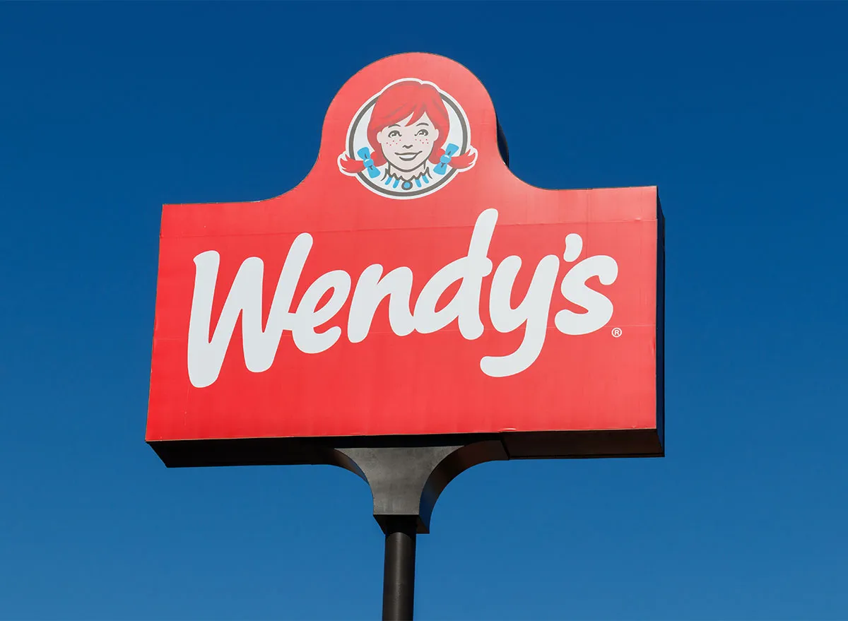
Wendy's has always had a red-headed girl on the logo, even after making slight changes to it in 2013. But did you notice the hidden message in the logo after the change? If you look closely, you'll notice that the girl's collar spells out "Mom" in the center. While Wendy's has denied any hidden intentions of having the word in the collar, it does pay tribute to the nostalgic, old-timey food traditions that customers love about this classic chain. And even if they deny it, they can't deny the reason they serve square patties on their burgers!
Starbucks
Ever wonder why Starbucks uses an alluring mermaid on their logo? It's clearly marketing, especially when you look at the history of this popular coffee chain. The name "Starbucks" was chosen when the founders were advised by an advertising specialist that a company starting with the letters "st" would be powerful. When they landed with "Starbo," one founder thought of the first mate of the Pequod in the classic novel Moby Dick. It then spiraled into a company named "Starbucks" that had hints of maritime in their marketing. While a mermaid isn't a part of the original Moby Dick story, using a siren (a mythical creature that lured sailors to shipwreck on their island) was an attractive way to lure in customers. Needless to say, the mermaid is used to seduce you into buying delicious coffee and pastries. And it works…doesn't it?
Taco Bell
Why in the world does this famous taco chain have a bell in its logo? Well, when you learn about Taco Bell's history, the name (and logo) becomes quite obvious. Taco Bell was originally created by a man named Glen Bell who created Bell's Drive-In and Taco Tia in San Bernardino, California in 1954. The name switched to "Taco Bell" in 1962, and the first bell appeared on the Taco Bell logo in 1985. Since then, Taco Bell's logo has made quite a few transformations, but having a bell on the logo has always remained.
Subway
Subway's logo may seem pretty straightforward, but give it a closer look. Notice how the 'S' and the 'Y' have little arrows on them? That's because they represent the entering and exiting of a subway, and reflect the speedy service that Subway offers to their customers.
Domino's
Ever wonder why Domino's chose to have only three dots on the domino in their logo? While the domino in this famous pizza logo could have technically been any combination of numbers, the chain originally used three dots to represent the original three Domino's locations. The intention was to add a new do each time Domino's added a new location, but as this famous chain quickly grew, Domino's decided to keep the original three. Just imagine what the logo would look like if it had dots for all of their locations now!
Burger King
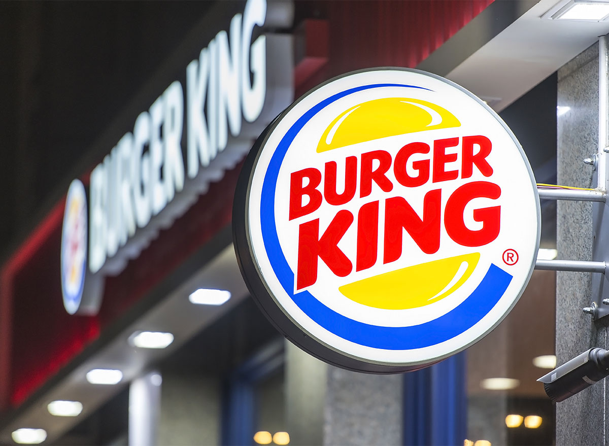
While Burger King's logo is a bit more obvious, if you're not paying attention, you may miss that the two words "Burger King" are sandwiched in between two burger buns. Subtle enough, but literal for Burger King's most prized meal offering.
Read more secrets about your favorite chains:
16 Things You Didn't Know About Walmart
